
I remember struggling with the lowercase cursive f. Over and over, I would write f’s on the lined beige paper (you know, the kind with two solid blue lines set about an inch apart with a dotted line between them). And every time I turned it in, my teacher would reject it and send it back, “not right,” or “your bottom loop goes the wrong way.” It was frustrating and discouraging. I wasn’t allowed to move on to the letter “g” until I got this right. And since my German parents wrote in a completely different style, there was no help from home. So, you can imagine how much empathy I have for German School children of the 1930s who had to learn four different alphabets in both upper and lower case! But why? Why did the old German cursive alphabet take so many forms? Why did the writing styles change?
There is a lot of history to unpack behind the story of German writing. The changes weren’t about making Genealogists weep in frustration (although I have my suspicions); they were really about German nationalism and pride in a language.
Read on to find out why reading your great-grandfather’s letters is so difficult.
Old German Cursive Alphabet and Typefaces
I’ll start at around 1000 years ago.
Blackletter, aka Gothic Script
Around 1050 AD, Blackletter, those strong, fancy “Gothic” letters you see in illuminated manuscripts, developed out of the even fancier Carolingian script because even in the Middle Ages, there was a need for speed and efficiency (You think your computer printer at work is slow? Try waiting for a group of monks to handwrite your new decree). Still, Blackletter evolved over time, and by the 1400s, it had split into several distinct subtypes. Gutenberg used Textualis, with its heavily angular styling, to print up the first Bible in 1455. (Stop and think about this for a second. Gutenberg used moveable type to print the Bible. EVERY LETTER needed to be set in a frame individually, like an alphabet puzzle. And it was still quicker than monks.) Then Martin Luther came along and started using the Schwabacher typeface in 1472 for his translation of the Bible. This rounder version was less harsh-looking and became common in Germany as Lutheranism spread.
Then, in the 17th century, Fraktur replaced them all.
Albrecht Dürer, Public domain, via Wikimedia Commons
Fraktur Script
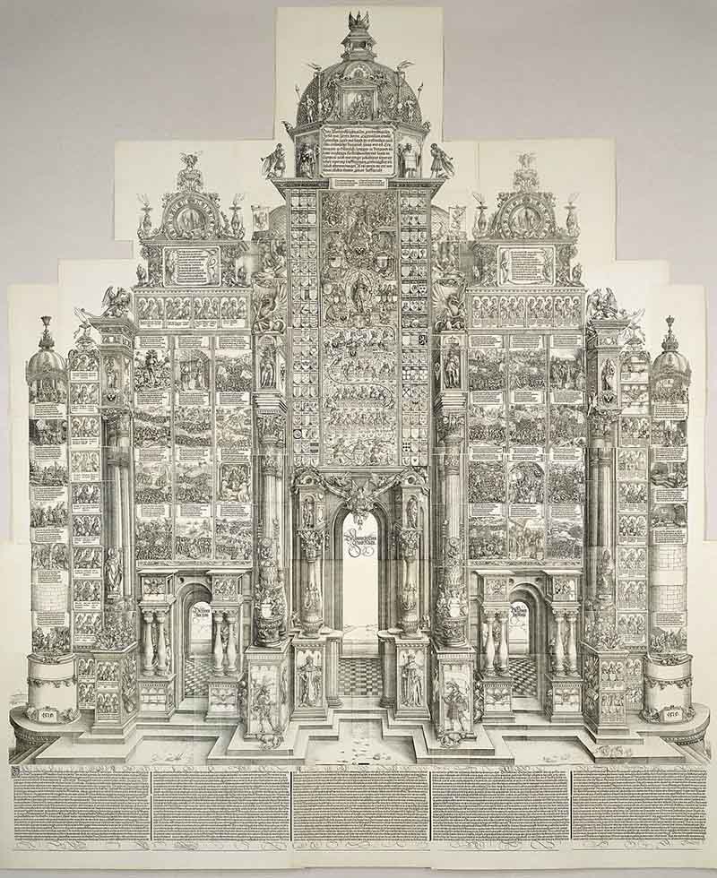
In the early 1600s, Holy Roman Emperor Maximilian 1 commissioned a woodcut from Albrecht Dürer called “The Triumphal Arch.” Hieronymus Andreae, an associate of Dürer, created a new typeface specifically for the artwork. It included special German characters, such as the ß and umlauts, which were missing from earlier typefaces. They named it “Deutsche Schrift,” but the rest of the world called it Fraktur. The name Fraktur comes from the Latin meaning “broken script” or “fractured.” All those swirls, flourishes, and curlicues in the Fraktur letters break up words.
While the rest of Western Europe used a typeface called Antiqua, an unadorned style of Gothic script, the German world transitioned to the “Deutsche Schrift,” aka. Fraktur. Books, journals, and all printed materials were printed in Fraktur. When Napoleon broke up the Holy Roman Empire in 1806, a Nationalist movement worked overtime to preserve German cultural values and canonize German literature. In the eyes of many Germans, Antiqua, with its simple style, was “light and frivolous,” not serious enough for the strength of German writings. (This might be one of the most German things ever.) And in 1871, when the German Reich was established, “die deutsche Schrift” became the standard. The government publications were to be printed in Fraktur.
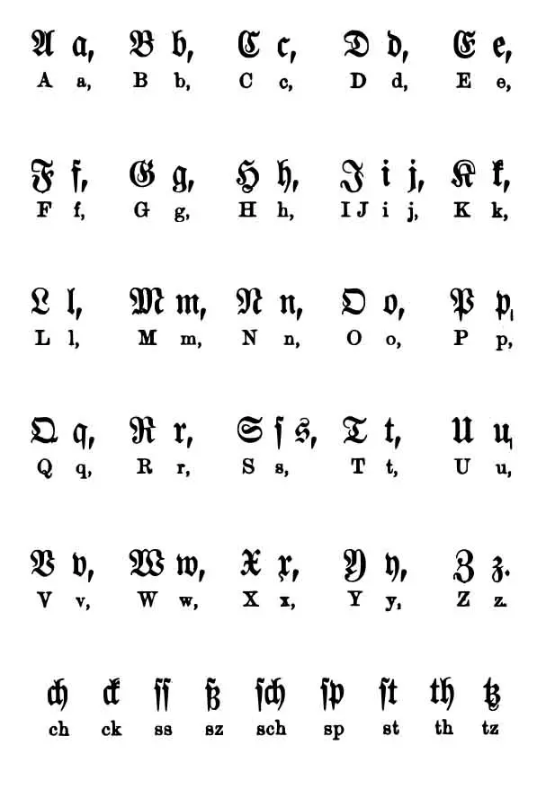
The Fraktur Alphabet
The Antiqua-Fraktur dispute!
Not everyone was thrilled with this new development. German scientists continued using Antiqua to share their discoveries with the non-German-speaking world. Printers published German books and publications in Fraktur, but any foreign words in those books were set in Antiqua. (That must have been fun down at the printing house)
It looked a little bit like this.
But the hardliners prevailed, and the nerdy scientists had to take a back seat on this issue. Fraktur, or Deutsche Schrift, was to be used exclusively in German texts, and nothing else!
(An apocryphal story about Otto von Bismarck sums it up. It’s said he refused to read any book not printed in German typefaces. And, he even RETURNED gifts if they contained Antiqua. “Deutsche Bucher in lateinische Buchstaben lese ich nicht!” I will not read German books in Latin letters!)
The upside of Antiqua is that anyone could easily write it by hand. On the other hand, Fraktur had a completely different written alphabet, known as Kurrent.
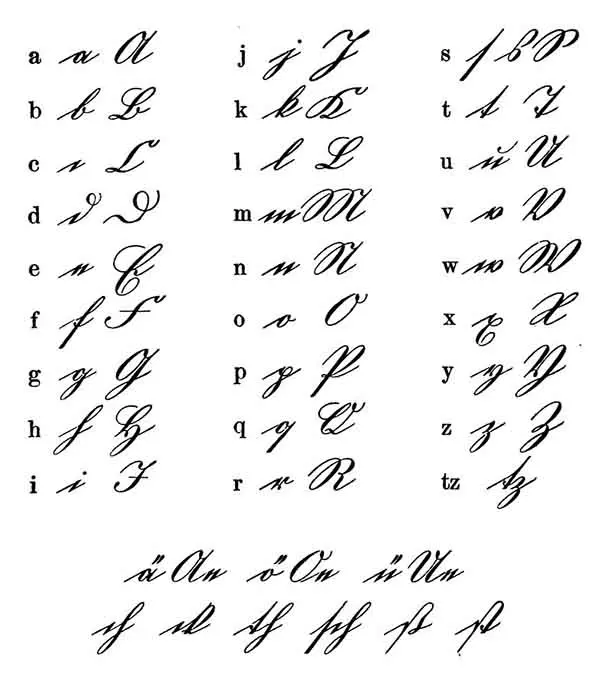
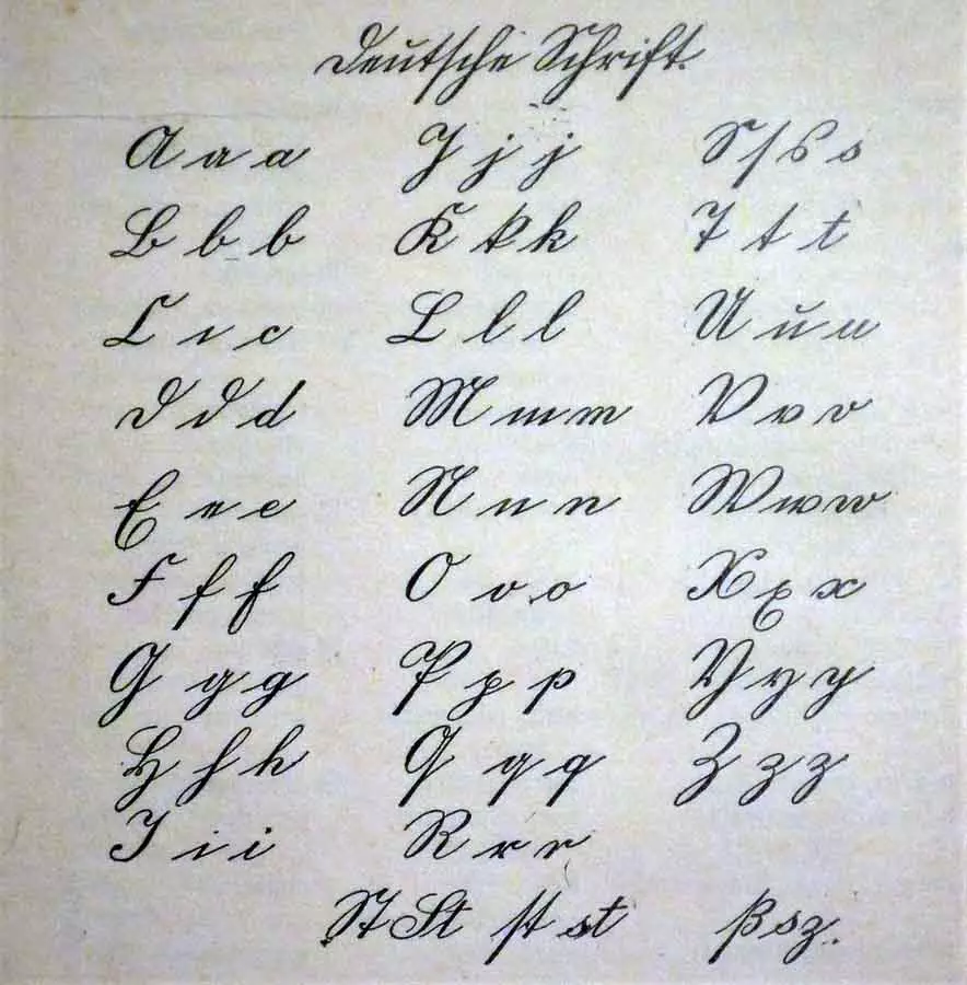
Kurrent Schrift- Fraktur’s handwritten style
Kurrent Schrift
Because Fraktur was CLEARLY too complex to use while dashing off a grocery list, people used its handwritten counterpart, Kurrent, the original old German cursive alphabet. While Fraktur means “broken,” Kurrent means “runs together.” You don’t have to keep picking up the pen when writing in Kurrent.
Kurrent was used from the 15th to the 20th century and taught in schools as THE Deutsche Schrift, German Writing Style, until 1941. Yet, it comes with its own tricky bits. The Kurrent alphabet is loaded with sharp angles and sudden changes in direction. There are three different “s’s,” depending on where the letter falls in the word. And it’s confusing for the modern reader because some letters look like our contemporary ones but aren’t the same. For example, the lowercase Kurrent “h” looks like a modern “f” so Tochter looks like Tocfter).
At this point, German students were learning 4 different Alphabets, just to get by. (It’s enough to bring a mom to tears thinking about the homework.)
Fraktur
Kurrent
Antiqua
Latin
Latin would be the unadorned handwriting of any other language like Spanish or French. (I have great empathy for any of the kids who decided to learn Greek or Russian on top of this).
Then a new German Alphabet came along.
Sütterlin Schrift
When the 20th century rolled around, the Prussian Ministry of Science, Art, and Culture decided it was time to update Kurrent. In 1911, they commissioned Ludwig Sütterlin to create a modern German handwriting system. By 1920, children across Germany learned Sütterlin.
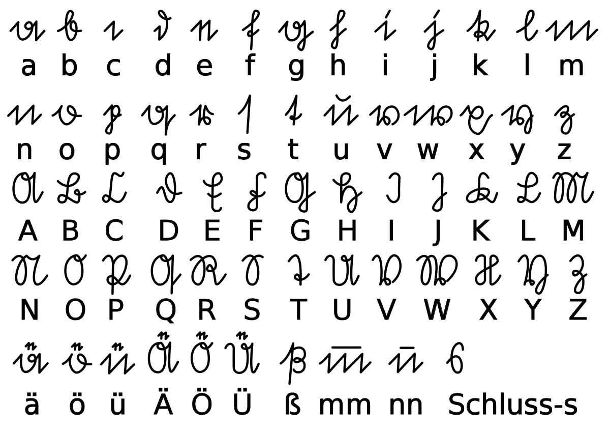
Sütterlin Schrift
The point of the exercise was to make handwriting “easier to read and write.” The design took the Kurrent alphabet and modified its proportions slightly. Now you could write your name without changing the pressure on your pen.
Unlauts are indicated by a small “e” above the vowel as if they tried to squeeze it in. Note that it’s a Sütterlin “e,” so it looks like a tiny “n.”
Offenbacher Schrift.
Not to be outdone by the Prussians, the Hessians introduced THEIR new script, the Offenbacher Schrift, in 1927. This script, created by Rudolf Koch, encouraged freedom and creativity! Naturally, since individual Freedom and Creativity were not very encouraged in Germany, especially in the early 20th century, the script wasn’t used outside of Hesse.
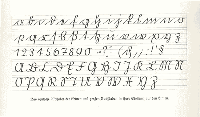
Introducing Normalschrift, a step away from the old German Cursive Alphabet and typefaces
The Nazi era in Germany brought new Script changes. What happens when you want to take over the world, but no one can read your propaganda? It’s problematic. Sütterlin was still taught in schools, but Fraktur got a simplified overhaul. For posters and signs, the Nazis used the Schaftstiefel Grotesk typeface (Combat Boot sans-serif). This simplified “Blackletter” typeface may look familiar since it still appears in design today.
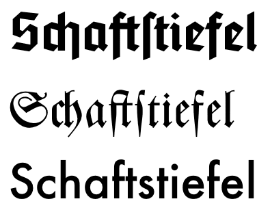
Top line – Schaftstiefel font
Center line- Fraktur
Bottom line- Futura
But of course, there was a problem.
In 1940, after years of promoting German typeface and handwriting styles, the realization set in that it would be impossible to force people in occupied lands to change their writing style. Additionally, and I imagine this was an even bigger issue, it was extremely expensive to send new Typefaces to all the publishers of books, newspapers, and journals in other countries. (I can imagine the poor guy from the budget office who had to break the news to Hitler that sending crates of German Type all over Poland and France was costing an arm and a leg.) On the other hand, since Hitler hated the look of it anyway (artists have strong opinions about fonts), he waved his hand and made it go away.
The Schrifterlass, Edict about Script, of January 3, 1941, officially forbade Blackletter typeface. Their excuse? An invented Jewish connection to the invention of Fraktur. (Never mind the irony of sending out the Schrifterlass WITH BLACKLETTER TYPEFACE in the header…!) A follow-up edict banned Kurrent and Sütterlin. (At this point, I’m sure parents were tearing out their hair.) Normalschrift (Normal Script), also called Latinschrift (Latin Script), took its place in 1941/1942. Antiqua replaced Fraktur in printed materials. Still, the old Kurrent script was used through 1945 in some areas, likely because they wanted to utilize existing stock. Material shortages meant waste was unthinkable. And no German will throw away perfectly good letterhead just because the government changed typefaces AGAIN.
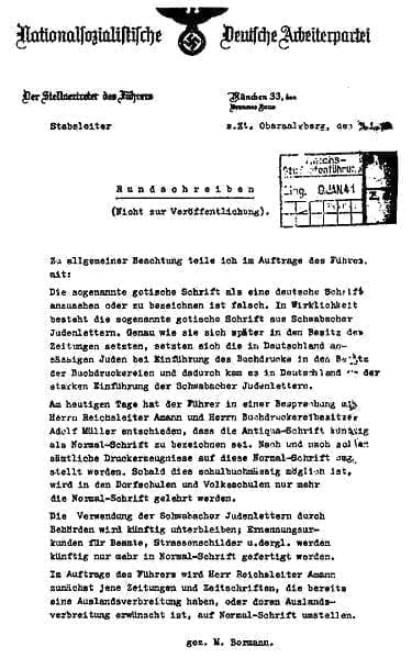
The 1941 Schrifterlass, forbidding Fraktur… ironically uses Fraktur in the Header
After World War 2, things were messy in the world of handwriting. While schools were supposed to teach Normalschrift, some schools still taught Sütterlin. (I imagine it had a lot to do with a lack of teachers and teaching materials.) Some kids were still writing in Kurrent because their parents taught it to them at home.
As for Fraktur printing, publishers continued to print some books and newspapers in the old script—the Frankfurter Allgemeine still uses it in its masthead. Many restaurants continue to use it in their Menus, and still do today, because the style evokes a “German-ness.” You will also find Fraktur in Pennsylvania Dutch art.
After a few years, Normalschrift or Lateinschrift became the standard.
Writing in Germany Today
The standard didn’t last very long, though, naturally, because in the late 1960s and early 1970s, the emphasis in German schools shifted from writing to reading. The new Vereinfachte Lateinschrift (simplified Latin letters) corrected all the “mistakes” of the original Normalschrift. Mostly where letters end and connect to each other in words. Let’s think back to that lined beige paper that we learned to write on, with the Vereinfachte Lateinschrift, all letters ended on the dotted line in the middle instead of at the top, bottom, or wherever.
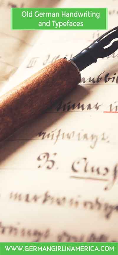
The Problem for Historians and Genealogists is that the Old German Cursive Alphabet Changed
Making sense of German historical records can be challenging because the old German Cursive Alphabet and typefaces underwent frequent changes.
In my closet, I keep an old Lebkuchen Tin full of letters. Sifting through them is like a trip through the history of German handwriting. My mother’s style is clearly Sütterlin; my Oma wrote in Kurrent. Letters from my older cousin are in Normalschrift, and the younger ones write in Vereinfachte Lateinschrift. Interestingly, although my parents are only two years apart in age, it’s clear my father learned to write in Kurrent. He went to a different school.
For those of you working on your Family Tree, reading the old German cursive alphabet is an exercise in frustration. Digging into Genealogical records without aids to help you read them is almost impossible. Even if someone wrote in Kurrent, individual writing styles can make ledger entries frustrating to decipher. Is it any wonder that only 1% of Germans can read early German documents?
Fortunately, there are helpful tools available, and practice makes it easier (a lot of practice and a good magnifying glass). Think of it as a fun challenge.
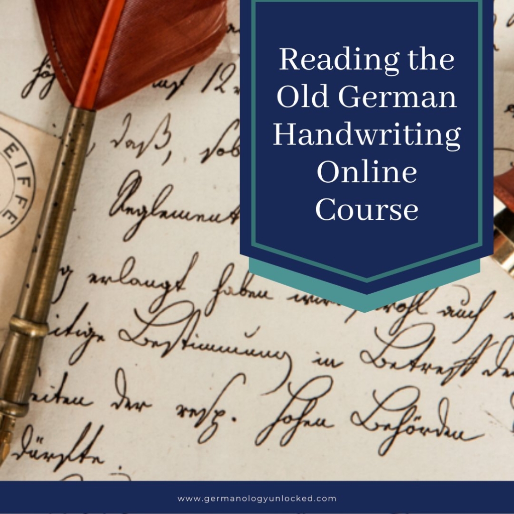
Germanology Unlocked
I finished my Reading the Old German Handwriting course! This online class from Germanology Unlocked leads you through the process from the alphabet to essential vocabulary. There are games and tricks for reading (is that an s? Or a d?). You even get a primer in reading German church records, although there is a whole other class for that here. You can revisit and review the lessons as often as you like. I keep the Worksheets and PDFs on my desk for reference. If you have old records to decode or love genealogy and want to make sense of those records, this class is essential!
<
Reading the Old German HandwritingGermanology Unlocked
Here are some helps-
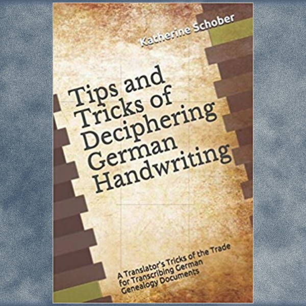
Tips and Tricks of Deciphering German HandwritingGermanology Unlocked
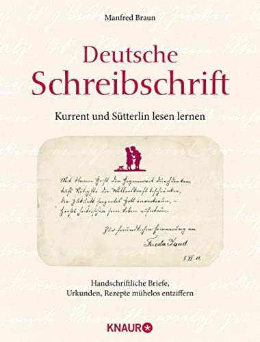
Deutsche Schreibschrift – Kurrent und Sütterlin lesen lernen: Handschriftliche Briefe, Urkunde, Rezepte mühelose entziffern Deutsche Schreibschrift. Lehrbuch. Lesen und Schreiben lernen.

.jpg)
Thank you so much for this article. It will help me in my translations and family research.
Great job on the article. Had some super information. Appreciated your efforts. I was able to now appreciate some of my grandmother’s letters and now understand why she wrote the way she did. Good insight. Vielen Dank!
Ich selbst bin in Neu-Isenburg geboren, beide Eltern waren Deutsche.
Thank you for this lesson in German handwriting. I never knew there could be so many changes….must have been hard to adapt to and even read!!
Thanks so much for this detailed information. Historically, it’s fascinating to know the story behind the story. Personally it’s equally of interest – I’ve struggled for years trying to make sense of it. I’ll check out the reference books.
My mother who was born in Prussia, wrote like that. She tried to teach me, but I failed terrible. Last Week I left a comment about Weisskohl. After that I wrote how my mom fixed Gruenkohl. That was a mistake. I meant to say Wirsing kohl, which is curlier then Weisskohl. Her Wirsing Eintopf was one of my favorites. Karen, I just love the way you write. Always makes me smile. You truly have a gift for writing. You ought to write a book someday soon. Blessings to all. Be safe and stay healthy. Gigi.
Thank You!!
Looking at Sütterlin, I note how upright the lettering is compared to the much more slanted Kurrent. I ran into something once which I’ll never be able to track down at this late date that discussed how there was a movement to shift to vertical penmanship around the turn of the 20th C. because it was thought to be better physically for the writer and also more legible. Modern French and British cursive lettering both are more upright than their 19th century counterparts and I suspect Sütterlin may have come out of this educational movement in the teaching of handwriting, also.
Thank you for such a thoughtful and educational page! I have a very old German document which is a certificate of baptism. I had it somewhat translated but am unsure of the script used. I’ve compared with the scripts you’ve shared and am unable to find the script. I’m wondering if you might be able to help.
Possibly, and if not, I can steer you in a direction. Send me an email at [email protected]
Thats fantastic! So much more helpful than a pamphlet I had.
I took a screenshot of the Gothic alphabet so I can keep it on my desktop to compare easily.
I learned the old way of writing ( I think Suetterlin ) in the 60’s in grade school and can kind of read it now, even though it takes some effort. thanks for providing this interesting educational part of history !!
I have transcribed and translated hundreds of pages of ancient (not just old) letters, real estate documents and many others. So far, in all those years, there was one that I could not read. So if you need something translated (not free), I’ll be glad to assist. I am a translator by profession with a degree in translation from a German university and I am also certified German > English and English to German by the American Translators Association (ATA.) My company webpage does not specifically mention this ability if I remember correctly.
thank you!
Hi Karen, A great article.I live in Ireland and have 6 No, 19th century diaries all written in Kurrent. They are written by numerous different people and also seem to be signed by some famous people in Germany, one is dedicated to the Crones, all very interesting and available if You like to make me an offer. thank you. Liam.
I wouldn’t even know how to start valuing something like that
A fascinating informative article. I hada German pen pal70 years ago that my Mother could read her letters to me. One of those letters was saved, but not the translation. Then a German exchange student came to live with my Daughter’s family. She was not able to read the letter but sent it to her Father who was able to translate. Thank you for clearing up some of the confusion in the German language.
Paul Schmidt
you are quite welcome
Just stumbled upon this article, via Pinterest… What a great read! My handwriting has evolved over the years, influenced by the countries I served in while in the military. Germany was my first duty station, and letters home to Mom reflect the four years spent learning the language, traveling around the country. History was never a favorite subject when I was a young schoolgirl, but the more I traveled the more history I wanted to learn. Thank you for this well-written and informative posting.
I’m glad you enjoyed it.
If you have more interest in learning to read the old German Script, you might be interested in these classes….https://germangirlinamerica.com/germanology-unlocked-old-german-handwriting-genealogy/
Is there anyway I can print your article for my step father. My mother passed away and we have some family photo where we just cannot make out the writing. Most from around 1920’s. He is from Germany and I think this will help figure it all out
This page might help https://upload.wikimedia.org/wikipedia/commons/5/59/Deutsche_Kurrentschrift.svg
Or send me an email with images, I may be able to help work it out. [email protected]
I am so thankful to find your article! I am not German, but I am a genealogist, writing a historic novel with a family of German immigrants living in the manufacturing area of Northampton, Massachusetts known as Bay State Village. I am reading through some German birth, marriage, and death records from the 19th century and I didn’t recognize some of the handwriting. I asked my son since he had a year of college German, but he said that when he took a linguistics course for his BA in Creative Writing there was an alphabet that looked similar. But when I compared the two it didn’t look quite the same for a few letters. Now I can see that it was the lowercase “h” and some sloppy handwriting that had me stuck.
Off-topic, I am wondering if you know anything about marriage customs in regard to ages since this couple has two marriage records registered. The first time the girl was 16 years old and must have been pregnant when she married a man eleven years older than her and then lost the baby four months later. No telling if it was premature or just died at birth because there is only a death record for the child, not named. The second marriage registration to the same man came nine years later when she was 25 and he was 36. Their first child that lived was born the following year. The marriages were both Lutheran. The first two children were baptized Catholic, but the rest of their children were baptized Lutheran. Have you ever heard of anything remotely like these circumstances?
hi Debra… The old German handwriting is tricky. I just finished taking the German handwriting course from Germanology Unlocked-> https://germangirlinamerica.com/germanology-unlocked-old-german-handwriting-genealogy/
They also offer German language classes specific to genealogy. Katherine is a great teacher, and I can’t praise the classes enough. It’s more than just handwriting, it’s learning to interpret the old words too.
As for the marriage question. I honestly have no idea why they would marry twice… are you certain it was the same groom (SO MANY people had the same name, it trips genealogists up all the time). As for why there are Catholic and Lutheran baptisms? Another puzzle. Could be access to churches… could be a secret deal… could be covering bases or parental pressure. (My mother was Catholic, my father Lutheran… it was tricky for all involved, and the marriage was only allowed when they promised I would be baptized Catholic.)
If you want a second set of eyes on the research, send me an email- [email protected].
Protestants started keeping church records (marriages, baptisms, etc.) in the 1500s. The Catholics started in the 1600s. Prior to the 1500s, there are only tax records. Fortunately, only large cities were bombed during World War 2.
For genealogists, yes, there are many duplicate names. An uncle and cousins could have the same name. That is why nicknames were common. In addition, when a child died at an early age, often the new baby is given the same name.
Some women died during childbirth. That is why it was common for a man to marry again.
In addition, it was not uncommon for an unmarried woman to have children.
The Deutsche Schrift “c, e, i, m, and n” are almost identical. It can be challenging to decipher names.
Thank you for this information. I’m still fairly early in my Genealogy knowledge.
And of course, one of the great ironies is many of the neo-Nazi organisations love publishing things in Fraktur or similar Blackletter fonts because they look “more German” completely ignoring the fact that it was Hitler who banned them all!
Honestly… people need to know their history.
Hi Karen,
I have family bible that came from Germany sometime after 1850. It is printed in German. But it also has family writings birth, marriages. I have showed it to 3 generations of people from Germany 2 still living there. They were able to translate a few words that I know are correct as I grew up with my grandfather who was born in 1886. I was raised in the house my great grandparents bought when they came over from Germany. I know the dates but am having a little trouble with some names. I stumbled across your page and It has really made more sense as to why no one can read my bible. I have 1 aunt living she is the baby of family at 94 and doesn’t really remember much. Thank you for your help.
Hi Carol… I’m glad I could help. It sounds like you have a treasure.
Thank you for the lesson ,, My Oma had the most beautiful handwriting. She wrote in old German and I have no idea how anyone could read it but my mom could read and write it /
Old letters between my Oma and Opa take time and patience to read… the writing is perfect, but the paper is so thin…
Great article and very interesting, along with those styles of writing came the “Inkwell”
in my school desk, that means we had a “Quill” that allowed you different width with
different pressure on the quill, this was in my first year of school, 1940…..
Nowadays, if we can’t push a button, we can’t correspond………
Thanks for your article
You are most welcome.
I do treasure the handwritten note and letter… but admit I’m guilty of sending a quick What’s App to my cousin instead of sitting down with a pen and paper.
On rare occasions I would look up a recipe in my mother’s 2″ thick German Kiehnle Kochbuch. It was the last word in German cuisine in 1924.
When I could not decipher the Fraktur I would turn to the index at the back of the book and compare the curliques. The difference between the capital G and the Capital S is just a little wavy line but the G-curlique and the S-curlique were far apart in the alphabet and separated by pages in the index. It made guessing which was which very easy!
Thank you for the excellent overview. Sütterlin script has recognizable roots in Kurrent script. Both are handwritings with very individual characteristics, which are nevertheless legible if you have learned one of them once in your life.
When I started school in 1954, we learned the Latin script. However, in the third grade, a few weeks were devoted entirely to Kurrent script. It could also have been Sütterlin script, but after 70 years I can no longer say for sure. The reason for this is that both forms are so closely related that you can read both without any problems.
So I would like to encourage anyone who wants to start reading these scripts. It is not difficult. With the individual characteristics of handwriting, you will find many forms that lie somewhere between Kurrent and Sütterlin anyway.
Thank you for your kind words and your encouragement. I wish I had learned the different scripts properly as a child… today I can read them, with some effort, but writing is very difficult. My handwriting was always a bit crabbed looking, but I think now the keyboard spoiled me. It will take work.
Hi Karen,
I am a historian and always use this page to translate typed and written German script. I am so grateful for this resource and wanted to let you know!
Hi Sarah, I’m delighted that I can help you!
If you have to do frequent translations, you might consider checking out these classes from Germanology Unlocked. They were a HUGE help to me.-> Germanology Unlocked
Amazing! Thank you so much!
Many years ago, my father told me that German words never ended with “es”. It was either “es zet” or “schluss es”.
I have read letters and church council meeting minutes that used “schluss es” and “es zet”.
Even though I was born in North Dakota, my mother tongue is German. Es war ein lange Zeit zurück.
Which comment?
I too was struggling with some early 20th century documents from my grandparents. I sat for hours with Google Translate, trying to decipher various letters. I thought I was so proud of myself and showed them to my daughter explaining the painstaking process with Google. She explained to me that there is a camera icon on Google Translate. You first notate “German to English” then hold your device over the document, click the camera icon and you’ll get the written translation on your device. Thought this might help someone.
It might help with more recent documents, but I do find mistakes with google translation of older handwriting. I’m glad it helped you.
Hello I’m writing an essay on how culture and politics are linked in Germany and was wondering if you knew the name of the nationalist group that advocated for a preservation of German culture after 1806?
Thankyou
Hi Celeste, I’m just seeing this. It sounds like you are asking about the Romantic Movement. I’ll do some digging.
Can you send me an email-> [email protected].
Karen